- LIVE HELP IS

How Do I Create Normal Probability Plots in Excel Using SigmaXL?
- Create 100 random normal values as follows: Click SigmaXL > Data Manipulation > Random Data > Normal.
Specify 1 Column, 100 Rows, Mean of 100 and Standard Deviation of 25 as shown below:

- Click OK. Change Column heading to Normal Data.
- Create a Histogram & Descriptive Statistics for this data. Your data will be slightly different due to the random number generation:
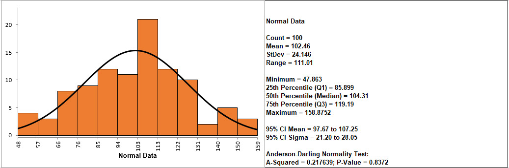
If the p-value of the Anderson-Darling Normality test is greater than or equal to .05, the data is considered to be normal (interpretation of p-values will be discussed further in Analyze).
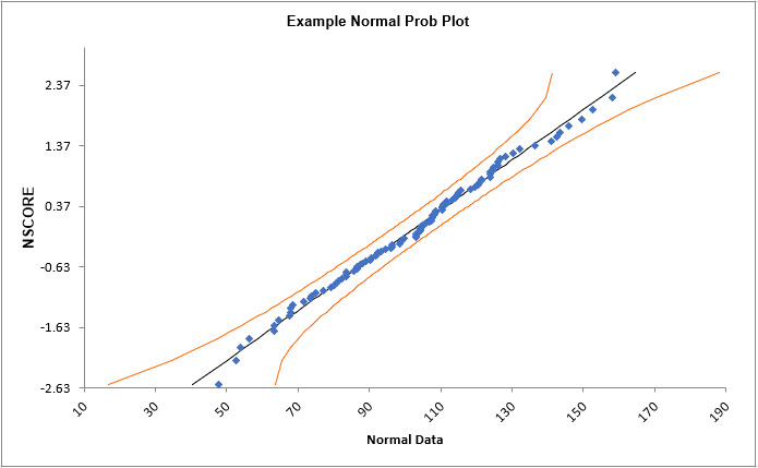
- Create a normal probability plot of this data: Click Normal Random Data (1) Sheet, Click SigmaXL > Graphical Tools > Normal Probability Plots.
- Ensure that entire data table is selected. If not, check Use Entire Data Table. Click Next.
- Select Normal Data, click Numeric Data Variable (Y) >>. Check Add Title. Enter Example Normal Prob Plot. Click OK
- Click OK.
A Normal Probability Plot of simulated random data is produced (again, your plot will be slightly different due to the random number generation):
- Click Sheet 1 Tab of Customer Data.xlsx.
- Click SigmaXL > Graphical Tools > Normal Probability Plots.
- Ensure that entire data table is selected. If not, check Use Entire Data Table. Click Next.
-
Select Overall Satisfaction; click Numeric Data
Variable (Y) >>. Click OK. A Normal
Probability Plot of Customer Satisfaction data is produced:
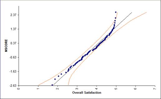
Is this data normally distributed? See earlier histogram and descriptive statistics of Customer Satisfaction data.
- Now we would like to stratify the customer satisfaction score by customer type and look at the normal probability plots.
- Click Sheet 1 of Customer Data.xls. Click SigmaXL > Graphical Tools > Normal Probability Plots. Ensure that Entire Table is selected, click Next. (Alternatively, press F3 or click Recall SigmaXL Dialog to recall last dialog).
- Select
Overall Satisfaction, click Numeric Data Variable
(Y) >>; select Customer Type as Group
Category (X) >>. Click OK. Normal
Probability Plots of Overall Satisfaction by Customer Type are
produced:
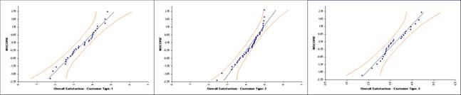
Reviewing these normal probability plots, along with the previously created histograms and descriptive statistics, we see that the satisfaction data for customer type 2 is not normal, and skewed left, which is desirable for satisfaction data! Note that although the customer type 2 data falls within the 95% confidence intervals, the Anderson Darling test from descriptive statistics shows p < .05 indicating non-normal data. Smaller sample sizes tend to result in wider confidence intervals, but we still see that the curvature for customer type 2 is quite strong.
Tip: Use the Normal Probability Plot (NPP) to distinguish reasons for nonnormality. If the data fails the Anderson Darling (AD) test (with p < 0.05) and forms a curve on the NPP, it is inherently nonnormal or skewed. Calculations such as Sigma Level, Pp, Cp, Ppk, Cpk assume normality and will therefore be affected. Consider transforming the data using LN(Y) or SQRT(Y) or using the Box-Cox Transformation tool (SigmaXL > Data Manipulation > Box-Cox Transformation) to make the data normal. Of course, whatever transformation you apply to your data, you must also apply to your specification limits. See also the Process Capability for nonnormal data tools.
If the data fails the AD normality test, but the bulk of the data forms a straight line and there are some outliers, the outliers are driving the nonnormality. Do not attempt to transform this data! Determine the root cause for the outliers and take corrective action on those root causes.
The data points follow the straight line fairly well, indicating that the data is normally distributed. Note that the data will not likely fall in a perfectly straight line. The eminent statistician George Box uses a “Fat Pencil” test where the data, if covered by a fat pencil, can be considered normal! We can also see that the data is normal since the points fall within the normal probability plot 95% confidence intervals (confidence intervals will be discussed further in Analyze).
Define, Measure, Analyze, Improve, Control


Simulate, Optimize,
Realize

Web Demos
Our CTO and Co-Founder, John Noguera, regularly hosts free Web Demos featuring SigmaXL and DiscoverSim
Click here to view some now!
Contact Us
Phone: 1.888.SigmaXL (744.6295)
Support: Support@SigmaXL.com
Sales: Sales@SigmaXL.com
Information: Information@SigmaXL.com
 Facebook
 LinkedIn
 YouTube
Copyright © 2002 - SigmaXL | Privacy Policy & Legal Notices | Terms & Conditions