Open New York Daily Cycle Time Discrete.xlsx. This is data from the
Sigma Savings and Loans Company, New York location. Each day, the cycle time (in days)
for completed loans and leases was recorded.
N indicates the number of loans counted. A Fail was recorded if the
cycle time exceeded the critical customer requirement of 8 days. Note that we are not
recommending that continuous data be converted to discrete data in this manner, but
rather using this data to illustrate the use of P charts for Discrete or Attribute data.
P Charts (for Defectives) can have
fixed or varying subgroup sizes.
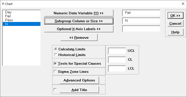
Select SigmaXL > Control Charts > Attribute
Charts> P. Ensure that
B3:E23 are selected, click Next.
Select Fail, click Numeric Data Variable (Y)
>>; select
N, click Subgroup Column or Size >>. If we had a fixed
subgroup size, the numerical value of the subgroup size could be entered instead of
Column N. Check Tests for Special Causes.
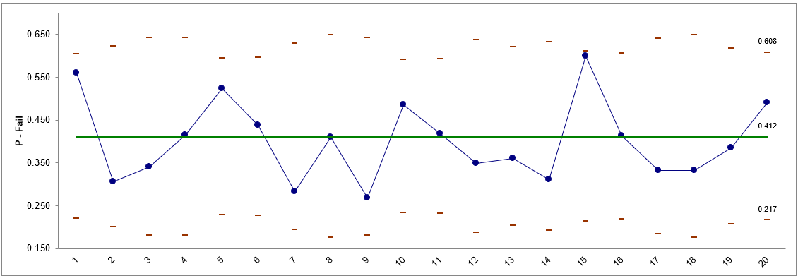
Click OK. The resulting P-Chart is shown:
The moving limits are due to the varying sample sizes. While this P-chart shows stability, a
much bigger concern is the average 41% failure rate to deliver the loans/leases in 8 days or
less!
P-Charts: Advanced Limit Options
Historical Groups
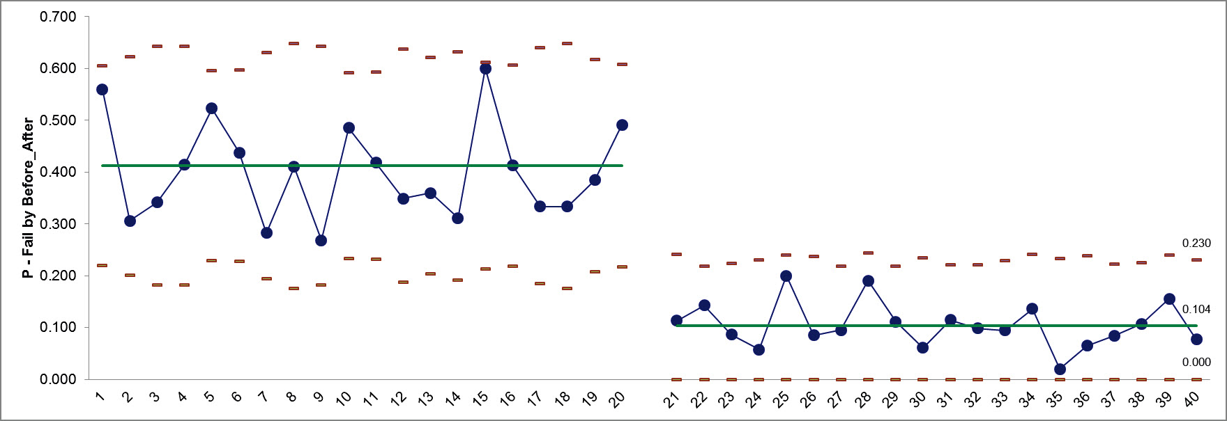
Open New York Daily Cycle Time Discrete Before After
Improvement.xlsx. Before_After denotes before improvement and
after improvement.
We would like to use a P-Chart with historical groups to split the limits demonstrating
the before versus after improvement.
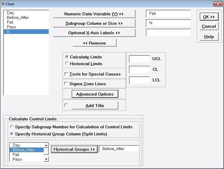
Click SigmaXL > Control Charts >
Attribute Charts > P. Ensure that the entire data
table is selected. If not, check Use Entire Data Table. Click
Next.
Select Fail, click Numeric Data Variable (Y) >>; select
N, click Subgroup Column or Size >>.
Click Advanced Options. Select Specify Historical Group
Column. Select Before_After, click Historical Groups
>>.
Click OK. The resulting P-Chart with split limits based on historical
groups is shown, demonstrating a clear process improvement: